Help choosing my business logo

timmymacs

New Member
Reaction score
0
Location
Perth, Western Australia
Hi Guys,

Put my new business logo up for award on one of the big graphic design sites and have had a few good entries already. I'm after more of a modern, slick design to appeal to the business and corporate world as that is my main area of interest now.

Please let me know what you think and which one you like the best!
 

Attachments

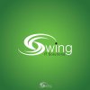
  • swingboldjpg.jpg
    swingboldjpg.jpg
    51.7 KB · Views: 219
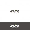
  • 3729628_Swing-IT-Solutions_24062011.jpg
    3729628_Swing-IT-Solutions_24062011.jpg
    36.3 KB · Views: 201
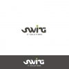
  • sit 02.jpg
    sit 02.jpg
    29.6 KB · Views: 192
Number 1 for me too.
Out of interest which site did you use?
I'm thinking our logo needs a bit of an upgrade.
 
I used crowdspring.com have used them in the past and they always come up with the goods. Thanks for the feedback, I like the first one as well but I also like this one. What do you guys think?
 

Attachments

  • abbc.jpg
    abbc.jpg
    18.9 KB · Views: 95
Personally I think it's pretty cool, but if your target market is "what's a start button?" then I'd say no. As everyone else said, #1.
 
Hi Guys,

Put my new business logo up for award on one of the big graphic design sites and have had a few good entries already. I'm after more of a modern, slick design to appeal to the business and corporate world as that is my main area of interest now.

Please let me know what you think and which one you like the best!
Out of those three the first is the cleanest and most vivid.

The problem I have with it is the name of the company appears to be almost crossed out by the wave graphic, like it has been crossed off a list or something.

As a designer I avoid covering up a clients name in a logo as it makes it harder to read and works against why you have a logo in the first place, to get your name out there and not covering it up.
 
Last one...but see pic

I like the last one, but agree it's hard to read. I think the main reason it's hard to read is the 'S' looks like it's laying on it's side. Change it so it's more like a normal 'S' (see attached - rough edit) and you have a winner.
 

Attachments

  • templogo2.jpg
    templogo2.jpg
    4.9 KB · Views: 77
I like the first one the best but do something about the swish through the wording. Its the focal point and the wording looks like its in the background.
 
Back
Top