Need Business Card Critique

GlitchGuards

Member
Reaction score
0
Location
Carrollton, Ga
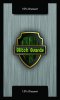
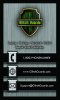
Been "working" (more like worrying) on these cards for about 2 months now trying to get them just right for a good blend of professional and dual-usage (coupons). After about 5 designs this is what I've got..

My idea was to give them out and mention the discount on the back.. Once I meet up with the customer for a job they'd hand me the card and choose which discount they'd like (I chose 2 to give them an incentive to come back and hopefully I can wow them enough with 2 jobs to keep them). After choosing their discount I'd simply blank out the white letters with a black marker effectively leaving the card in tact with little design change.

So what do you guys/girls think? Be brutal! :D
 

Attachments

  • Back (bordered).jpg
    Back (bordered).jpg
    96.3 KB · Views: 155
  • Front (bordered).jpg
    Front (bordered).jpg
    95.8 KB · Views: 156
Well I called 1-800-phonenumber, I got a recording from Tina wanting me to joint the party! Seriously!!! (Sorry could not resist!!!!)

Interesting looking card. Personally I'm not a fan of cards with filled backgrounds. If you give people blank space they might write on it, thus giving you "eye" time. On the discount thing. Having two discount numbers does create a point of discussion. But you need to be able present a quick and easily understood response to not loose the customers attention.
 
Not a big fan of the background either. White may be better. Don't like the black border. Think Discount font size should be bigger.

You may want to try one of the those services where people make lots of designs for you to choose from. You can search forum for places, one that comes to mind is http://99designs.com/, but that looks kinda expensive. At the very least, you can get more ideas.

*I do like the discount that you mark off (assuming someone doesn't just mark it off themselves), good idea!
 
Well I called 1-800-phonenumber, I got a recording from Tina wanting me to joint the party! Seriously!!! (Sorry could not resist!!!!)

Interesting looking card. Personally I'm not a fan of cards with filled backgrounds. If you give people blank space they might write on it, thus giving you "eye" time. On the discount thing. Having two discount numbers does create a point of discussion. But you need to be able present a quick and easily understood response to not loose the customers attention.

LOL! Please excuse Tina, shes new :D

Thanks for the review. I was hoping they'd write on the metal area if they needed to, which is why I opted out of going completely dark. Do you think that could work? Also, would you mind elaborating on your last sentence about the quick and easy response? Do you mean I should come up with a script when they ask about the discounts to keep the ball rolling?
 
Not a big fan of the background either. White may be better. Don't like the black border. Think Discount font size should be bigger.

You may want to try one of the those services where people make lots of designs for you to choose from. You can search forum for places, one that comes to mind is http://99designs.com/, but that looks kinda expensive. At the very least, you can get more ideas.

*I do like the discount that you mark off (assuming someone doesn't just mark it off themselves), good idea!

Ok so thats 2 strikes against the background :( I really liked it too. I'll definitely increase the discount size; thought that was an issue myself. And i'll check out that site for some ideas, thanks.
 
LOL! Please excuse Tina, shes new :D

Thanks for the review. I was hoping they'd write on the metal area if they needed to, which is why I opted out of going completely dark. Do you think that could work? Also, would you mind elaborating on your last sentence about the quick and easy response? Do you mean I should come up with a script when they ask about the discounts to keep the ball rolling?

The pattern is OK. Just too dark. Do a test. Print out a few, write on them with different writing instruments and see what others think about the legibility.

On my last comment. In another life I had a sales position in a services business (not IT) so I am always thinking about sales cycles in my daily interactions with people. Two things are important in maintaining a dialog with a potential customer. One is providing avenues for discussion, especially when they initiate it. Second is being able to succinctly deliver a meaningful response to a question. So you should think up and practice delivering maybe 2-3 different responses to the "Why is there two different discounts" question which is sure to pop up.
 
Last edited:
The pattern is OK. Just too dark. Do a test. Print out a few, write on them with different writing instruments and see what others think about the legibility.

On my last comment. In another life I had a sales position in a services business (not IT) so I am always thinking about sales cycles in my daily interactions with people. Two things are important in maintaining a dialog with a potential customer. One is providing avenues for discussion, especially when they initiate it. Second is being able to succinctly deliver a meaningful response to a question. So you should think up and practice delivering maybe 2-3 different responses to the "Why is there two different discounts" question which is sure to pop up.

Actually just got done showing around a printout of the cards. Only showed it to family so far but the response is positive; background isnt dark on the paper (computer paper), more of a very light grey which I was going for. I asked them specifically about some of the points discussed heree and hopefully I can get with some younger friends and see what they think as well just to make sure it bodes well with all ages. Might tweak around with the borders a bit as I think they're too thick on the demo, but all in all I'm getting confident about having them printed.

I'll definitely start thinking of explanations now as well. Its pretty straight-forward and I'm sure when most people read "discount" they'll be more attracted to the service by default. We'll see though. Again, thanks a lot for the help.
 
I'm old school and the back of the business card should be blank white and non-glossy.

It gives the person you're giving it to a place to write and make notes about you and your business and since you don't have you name on the card, they will need someplace to write it down

I have been able to slip a card into a conversation with several people when one of them needed a place to write on. Ended up getting called by that person down the road because he turned my card over and say what I did.
 
Last edited:
Actually just got done showing around a printout of the cards. Only showed it to family so far but the response is positive; background isnt dark on the paper (computer paper), more of a very light grey which I was going for. I asked them specifically about some of the points discussed heree and hopefully I can get with some younger friends and see what they think as well just to make sure it bodes well with all ages. Might tweak around with the borders a bit as I think they're too thick on the demo, but all in all I'm getting confident about having them printed.

I'll definitely start thinking of explanations now as well. Its pretty straight-forward and I'm sure when most people read "discount" they'll be more attracted to the service by default. We'll see though. Again, thanks a lot for the help.

Well, family is more likely to say they like it than not. Can't trust their opinion. Show it around to others, like you are here. The response of someone who can't feel guilt about crushing you very hopes and dreams is the type of feedback you are looking for.

Personally, I am not a huge fan of discounts on business cards. There is no time limit or service restriction. Could bite you in the end. I am also not a huge fan of the portrait card layout. Have you tried it landscape?
 
I used to run a promo offer on the back of my business card. Hardly anyone ever flipped the card over to even see it. Like others mentioned, it's a good idea to keep the back side blank to cut down on printing costs, able to write notes, etc. If you ever decide to change your promo offer you either have to burn through your remaining cards or just order new cards. After I killed my promo I didn't see any drop in business because people would just refer me. You don't need to wow someone in 2 visits because if they like what they see after the first one they'll hold onto your card. If they didn't like what they saw they're likely not going to call you again just to utilize another discount.
 
Back
Top