Website Redesign

Mushin

New Member
Reaction score
0
First I want to thank nXtGenPC for inspiring me with their awesome website.
I have been trying to decide what path I wanted to take with my .biz domain so for now I have decided to use it for a new site design. Also... I must confess I did track down the image of the "infections on the computer" but I got that from nXtGenPC. I did some digging first and found that there are quite a few places using it sorry....

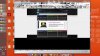
here is the old site

www.sitetechservice.com

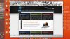
here is the site being redesigned (still in progress)

www.sitetechservice.biz

Please Let me know what your thoughts are.
 
In my opinion is too dark.

Is it the time of the year to redesign the websites? I'm also redesigning mine and it's expected to be ready by the weekend.
 
Last edited:
I like the look of it very professional. I have thought about re-doing mine but with a PR4 I really don't want to chance screwing with it for now. Maybe another one I have for something to do.
 
It looks organized but informative. In my opinion is too dark.

Is it the time of the year to redesign the websites? I'm also redesigning mine and it's expected to be ready by the weekend.

Are you talking about the boxes at the top and bottom of the main page? I am going back and forth on those with regard to color.

Keep in mind the old site is www.sitetechservice.com which is a full black background.
 
lol, sorry! I was looking at the old one. I like the new one. I would recommend to get rid of the joomla icon and place yours, this is the code that I use:

Code:
<link rel="shortcut icon" href="OrcaIcon.ico" />
 
looks great but the paragraphs are clipping on my copy of firefox. Looks ok in Opera.

If I adjust the Zoom level in FF, theres a large black block from the bottom of the footer that fills the entire screen.

I have my doubts about the marketing value of the section, "the computer revolution". Something with more selling value might be better placed in that spot which is central to the first impressions your visitors will form. You may only get one chance to sell your services, and Im not sure a dialogue about the origins of the Computer Service Industry is contributing much to that end.
 

Attachments

  • Untitled.jpg
    Untitled.jpg
    24.6 KB · Views: 65
  • Untitled2.jpg
    Untitled2.jpg
    24.5 KB · Views: 52
Last edited:
Thanks for the information on the firefox display differences. Also thanks for the advice for the contect of the site. I will have to look into the firefox differences.
 
I actually like this new design. I think the dark on top and light in the middle really helps the page flow well.

In regards to your new .biz extension, I would also grab the .co. Not because it is the new extension business's are picking up, but because if someone is typing your website quick, and hits enter before typing .com (ending up with .co) they will land at your site. I know I do this all the time.
 
Back
Top