New Vehicle Signage Critique

  • Thread starter Thread starter layoric
  • Start date Start date
L

layoric

Guest
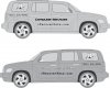
Finally getting to placing signage on the 2nd vehicle, a 2008 HHR (silver). I just did a mock-up of a simple design. Not sure if will go with more artistic wording, or just plain black to slap it on and get it done!

I have a small vinyl cutter, and black and white colored vinyl. I could throw up just black lettering, but the neighbor is a sign guy and he'll sell some colored vinyl at cost, and even cut out something that I'm unable to with my limited cutter. One mock-up has plain black, another a chrome look (shiny too, not translatable in image). The computer guy may/may not get colorized, but will at least be black/white to be easily sign on tinted windows.

Please let me know your thoughts ---
 

Attachments

  • HHR_SideView.jpg
    HHR_SideView.jpg
    83.9 KB · Views: 310
I like it, it's simple and easy to read and everything is where it should be.

However, what's the color of the car and the color of the things you're putting on there. White or Black is the best color of choice when putting graphics on a car, and then Orange, Blue and Green are very "showy" colors.
 
'Computer Services' covers a very broad spectrum of possible services you might be offering. I think you need something to attract the attention of your target customer base.

[potential customer mode]
"You just recover computer data. I need to find someone who can repair my computer..."
[/potential customer mode]
 
I like it, it's simple and easy to read and everything is where it should be.

However, what's the color of the car and the color of the things you're putting on there. White or Black is the best color of choice when putting graphics on a car, and then Orange, Blue and Green are very "showy" colors.

The same colors that are shown in the image. Grey car, black and chrome writing.
 
Yes

This is the proposed layout, although the two pc dudes look odd...
 
I happen to like it alot. I think your logo looks great on the vehicle and will capture attention. I also think people will remember the .com instead of the phone number. I'm glad to see your phone number is prominent on your website.
 
The phone number font looks similar to a credit card number. It could send the wrong message.

What I would do is use a designer from Elance.com to come up with a number of designs.
Good luck with the project and be sure to post a pic once done.
 
Personally I suggest putting your rear signage on your back window, as its in peoples eyeline more when behind you. Also you want your phone number to stand out just as much as the name as people might only get a spit second to write it down and wont want to be squinting to read it, imo.
 
Back
Top