Draft Business Cards

kcooke1983

New Member
Reaction score
1
Location
Carrickfergus, Northern Ireland, UK
Hi Guys

Please can you give me some feedback on a draft business card design.

I appreciate all constructive feedback.

I have saved these as jpg so that I can upload them.
 

Attachments

  • S25 Business Card Reverse DRAFT.jpg
    S25 Business Card Reverse DRAFT.jpg
    75.9 KB · Views: 193
  • S25 Business Card Front DRAFT.jpg
    S25 Business Card Front DRAFT.jpg
    89.9 KB · Views: 222
I realize this is more of a comment on your logo than your card but, since your logo is on your card....

I've always held on to the idea that if you have to point out your honesty, it calls it into question.

S25_Logo.png


Would you buy a car from "Honest John's"?
 
I think you need to include something like

"Leading IT Solutions For Home & Business", or something along those lines.

At the moment you card looks pretty but doesn't really explain what you do. I know the name does kind of give it away, but you might want to list, say, a couple of services you do on the front of the business card. Don't go overboard, because 'less is more', and you want to keep the design looking sharp.

Not sure if it's a glitch, but the 'L' in 'Maple Gardens' looks bold to me... might wanna check that out.
 
I'm not sure at all about the front or the back. Maybe I just live in the past but from someone who handed cards out all the time as a consultant in my previous job I think the layout is wrong. When one hands out a card it is usually telling someone who you are and your name would always be the centre of the card. Maybe it is just me. The reverse is a waste I think. On my reverse it gives out a lot of what I do. The reason I do that is because after getting my first lot of cards done(and a blank back) I had two locations offering to take the plastic stands for my cards to sit in. People then picked my cards up and wanted to know what i did. Of course I wasn't there so I decided on a double row of bullet points of my services.
 
The card is for making contact, I don't have my address on it. Just name, landline, mobile, web address, email address, MCSE logo and company logo on the front. I don't have my job title on it either so I can be whoever I want, wherever I want :D
 
Hi Guys

Thanks so much for the feedback.

I have quoted my requests to my designer so far...

Please can we look at making the following changes:

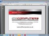
• Please can we remove my address from the Business Card.
• Please remove my Job Title.
• Please can we change the back of the card so that it displays a little of what I do. Please include:
  • Virus Removal
  • PC and Laptop maintenance
  • Back up and Recovery Services
  • System Repair and Upgrades
  • Memory Upgrades
  • Custom PC Builds
  • Software Upgrades

Should I add anything?
 
I dont mind the front of the card.

The back looks out of place - doesnt match the front - looks like an afterthought.

Dont like the tagline.

I think it would be worth using the space (as its a double-sided card and there's lots of useability there thats not being accessed) to state something about the services, so that when the card is passed from one person to another, the person that receives it can see at a glance that you are offering what they need.

Will send - PM - you a link to some ideas.
 
I have to agree with the others about the back, while it might look nice its really a waste of either money or space. If your going to spend the extra and get double sided cards then you should use that space for more than a logo in my opinion.

16k's idea about services is good, or maybe perhaps a little joke/line like "Computer not working? Check the cords and reboot, still not working? Call us!" or something better.
 
Back
Top