CaliZ
Active Member
- Reaction score
- 32
I've done a quick search on the forums for diagrams and infographics, specifically the creation/design of them, but resulted with minimal references.
As any company that becomes more efficient and organized, this topic comes up quite promptly. What is the best way to portray information either for documentation or purely informational?
For networks, racks, hardware, and other identifiable items, using a spreadsheet application such as Microsoft Excel works fairly well. Moving up from there I have used primarily Microsoft Visio and EDraw with mostly success. The key details I believe are knowing what is important to document, and what can be separated into another area/document.
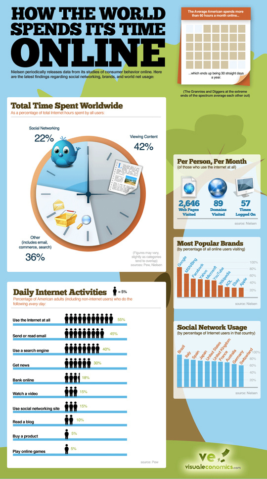
Clients of all sorts have questions, and can be verbally discussed, but having a visual aid definitely has helped bring down the tech barrier and have a level of understanding almost anyone can use. (Try explaining web hosting with the different layers of domain, DNS, hosting, database, SSL cert and where costs are calculated without drawing on paper.) I'm looking at doing more of the last picture in the below examples. (None of these are my works)
Microsoft Visio

EDraw

The last one in the above examples, I'm torn in to understanding if it was created/designed using anything other than Adobe Illustrator/Corel Draw. I have no problem dissecting such a creation, and spending an absurd amount of time to come up with a similar outcome for another topic, but does any one have had prior experience with this?
Further research has brought me to Visual.ly and Easel.ly but I have not yet played around with them yet. Any suggestions or thoughts are greatly appreciated.
Thank you.
As any company that becomes more efficient and organized, this topic comes up quite promptly. What is the best way to portray information either for documentation or purely informational?
For networks, racks, hardware, and other identifiable items, using a spreadsheet application such as Microsoft Excel works fairly well. Moving up from there I have used primarily Microsoft Visio and EDraw with mostly success. The key details I believe are knowing what is important to document, and what can be separated into another area/document.
Clients of all sorts have questions, and can be verbally discussed, but having a visual aid definitely has helped bring down the tech barrier and have a level of understanding almost anyone can use. (Try explaining web hosting with the different layers of domain, DNS, hosting, database, SSL cert and where costs are calculated without drawing on paper.) I'm looking at doing more of the last picture in the below examples. (None of these are my works)
Microsoft Visio
EDraw
The last one in the above examples, I'm torn in to understanding if it was created/designed using anything other than Adobe Illustrator/Corel Draw. I have no problem dissecting such a creation, and spending an absurd amount of time to come up with a similar outcome for another topic, but does any one have had prior experience with this?
Further research has brought me to Visual.ly and Easel.ly but I have not yet played around with them yet. Any suggestions or thoughts are greatly appreciated.
Thank you.