- You are here:
- Home »
- Blog »
- Starting A Computer Repair Business »
- Conversion Case Study: The Technibble Forums

Conversion Case Study: The Technibble Forums
This month I have been focusing on website conversions because its a really easy way to see significant gains in your business. Small tweaks can result in big gains. I practice what I preach so I am often making small changes here on Technibble. This article is a case study of one of those tweaks and the results it had.
The subject of this small case study is the Technibble forums. For a forum to be successful, it needs to maintain a certain amount of activity and one of the ways to do this is replenishing any members that drop off.
As with any kind of memberships, whether a magazine subscription or a gym, there is always a churn rate. We need to maintain a “critical mass” where there is enough people to talk to one another. If things slow down, people leave because there is no new content, resulting in even less content.
So for the Technibble forums, the most positive action is to get people to sign up. Therefore, the most important call-to-action is the “Sign Up Now!” button.
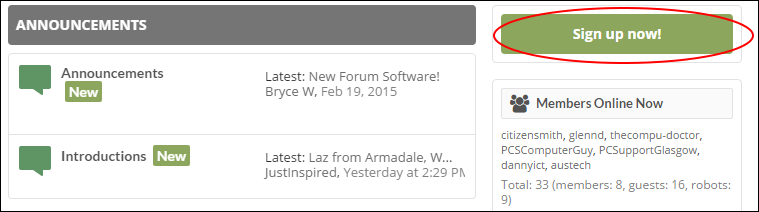
Originally the “Sign up now!” button was using a color that is common throughout the theme. This color is used elsewhere where the subtle green was appropriate and not too distracting, like the “[New]” boxes next to the sub-forum name.
However, this subtle green wasn’t appropriate for the call-to-action as it wasn’t standing out enough. It really needs to be the most obvious element on the page that peoples eyes are drawn to. So keeping with the green theme, I ramped it up to a bright fluorescent green.
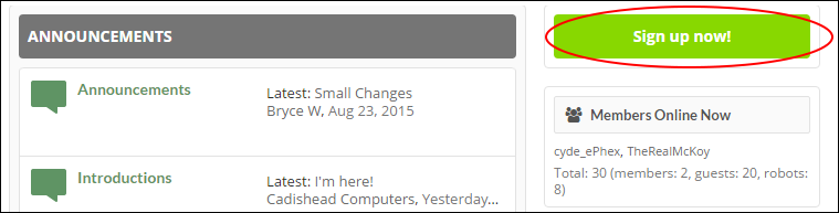
As you can see, its much more noticeable. I made the change back in June 2015 and let it run for a while to see whether it made any difference. Below is a line graph that represents how many sign-ups per month the forums were getting.
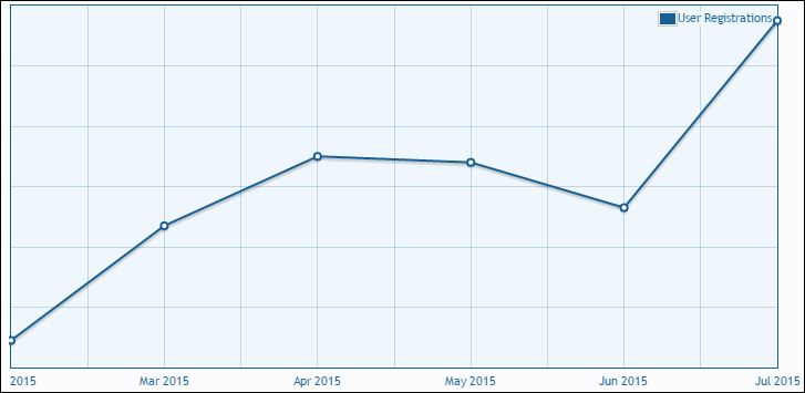
As you can see, the next month had sizable increase in sign ups. You have probably heard me use the example of “If you can push your conversion rate from 1% to only 2%, you essentially double the income your website generates”, and it’s so true.
In this case, sign ups was my goal rather than money – and I more than doubled my sign up rate.
You might be thinking, “I would have signed up (or not signed up) if I wanted to and don’t care about the color. These things don’t influence me”. Subtle elements like this actually influence us more than we think.
You might be driving down the road one day on a mission to go from point A to point B. You see the sign of your favorite fast food place and you begin to ask yourself whether you are hungry or not, or check to see whether you are nearing a meal-time. You weren’t on the way to get food, but now that you have seen the sign you are at least asking yourself whether you should eat there or not.
A similar thing happens on Technibble, a lot of people come from Google and land on the forums because they were looking for a solution to a specific problem (“driving down the road”). They didn’t come to Technibble just to sign up, but they saw the bright “Sign Up Now!” button on our virtual side-of-the-road, then considered it.
In a world where we are constantly bombarded with advertising, marketing these days is a battle for attention. If you can get someones attention and get your message across quickly, you are most of the way there. As demonstrated above, it often doesn’t take much to see big changes in your conversion rate.
Every day I see computer business websites that are letting potential customers “drive right past them” because their websites aren’t setup to convert. That’s why I launched a Website Analysis service.
We’ll take a hard look at your website and pinpoint elements where you aren’t getting your customers attention and converting them quick enough (your virtual road sign). We will then create a personalized PDF report detailing exactly whats wrong with your site, how to fix it and show examples of best practices.
If you feel your website isn’t generating the income you think it should, Order Now and find out why.
Session expired
Please log in again. The login page will open in a new tab. After logging in you can close it and return to this page.
As a designer, I “never” will use that color, but seems that works!! Thanks for sharing now I’m going to glow up my colors :)
It doesn’t have to be that color particularly, its just that contrast is key. Orange works well because its the most noticeable color that isn’t a “warning color” like Red.