Would like some critiques and ideas on my signs and sandwich board concepts

PCX

Well-Known Member
Reaction score
134
Updated on last post #9


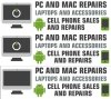
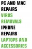
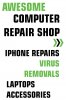
Just got the go ahead to put another sign up on the building my shop is located at and to put a sandwich board next to the road. Here are a few concepts that I am working on. I am by no means a graphics design artist, but I like the modern look that I am trying to accomplish. It has to obviously be readable, but I also want it to stand out and to look different and merit someones attention. Let me know what you guys think.

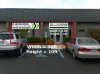
I have also included the sign that I already have up "store front sign" the "concept 2" sign will go next to this sign to the left.

More updated concepts in posts below.
 

Attachments

  • store front sign.jpg
    store front sign.jpg
    14 KB · Views: 264
  • concept 2.jpg
    concept 2.jpg
    75.9 KB · Views: 217
  • SANDWICH BOARD 1.jpg
    SANDWICH BOARD 1.jpg
    75.8 KB · Views: 245
  • SANDWICH BOARD CONCEPT 2.jpg
    SANDWICH BOARD CONCEPT 2.jpg
    77 KB · Views: 221
  • AWESOME COMPUTER SHOP.jpg
    AWESOME COMPUTER SHOP.jpg
    78.1 KB · Views: 231
Last edited:
I like the first sign. Not too sure about the other 4. One note: I think "iphone repairs" and "virus removal" should be on one line each (not iphone on a line, repairs below).
 
Check other signs with similar color. Green on White background might be hard to read during the day. The gray color might not be noticeable.

If you want to attract attention for your sandwich board, put a red circle with "/" (same as do not enter). Then put the word virus inside the circle. It's a tip I got from an advertising company. Driver pay attention to road sign.
 
Here are a couple things I am considering. First off, pretty much all the signage around here is ghetto and or plain, I want to try and avoid that if at all possible. Most signs that I have found that implements the "no sign" looks horrible and I really wanted to stick with my colors. I agree that the green may not be as readable during the day, but don't you guys think that it would make the sign stick out?

Anyways, my ultimate goal is to attract customers, but at the same time I would like to stick with my branding as much as possible. The sign that will go on the building will be about 3 feet high by 10 feet wide. The sandwich board will be 2 by 3 unless I get a custom one made.

@ rsarceno: If I were to go with the "no sign" can you tell me how effective it has been for you? Do you have any way of knowing if it made a difference?
 
Last edited:
Maybe its time to implement this guy . . . ?

I had this guy created as a concept for a possible mascot for the business.
 

Attachments

  • PC Exchange12.jpg
    PC Exchange12.jpg
    70.1 KB · Views: 171
sorry to keep updating this thread with very few responses, just wanted to add some of my progress. The first image is currently what my store front looks like, the second is a concept with the original sign and with a possible new sign. The next two images are store front concepts if I were to completely change the store front sign and add another. Keep in mind that the empty space between the two signs is what would be there when put up. Finally, just to give you guys an idea, the image is one of the proofs that I got from sign companies around Jacksonville when I was trying to get one made. This is only from one company, but pretty much all the rest of them sent me the same thing. This is what you would expect in my town, this is what I am trying to avoid and be the complete opposite of.
 

Attachments

  • 6.jpg
    6.jpg
    93 KB · Views: 123
  • store front with sign and concept.jpg
    store front with sign and concept.jpg
    19.5 KB · Views: 132
  • STORE FRONT SIGN CONCEPT1.jpg
    STORE FRONT SIGN CONCEPT1.jpg
    56.9 KB · Views: 122
  • STORE FRONT SIGN CONCEPT2.jpg
    STORE FRONT SIGN CONCEPT2.jpg
    55.5 KB · Views: 119
  • The PC Exchange.jpg
    The PC Exchange.jpg
    91.9 KB · Views: 115
I don't like concept 2 for a road sign. On a flyer, people can take their time to read it, but drivers (hopefully) aren't spending too much time reading your sign. It just looks like a lot with the left-right-left thing. I do like the colors -- the white on your sign won't be as bright as the white on our screens, so I don't think you'll have a huge problem with readability.

I'm with 300DDR about putting the iPhone and virus text on one line each -- for road signs a line is seen as a full unit -- they will glance at your sign, not study it. Today I would read "Virus" and think "I don't want that." Tomorrow I read "Removal" and wonder what you're removing. The "Awesome Computer Repair" kind of works, since Awesome could be good to keep on one line, but I'd put "computer repair" on the same line; except it would probably be too small to see.

Have you looked at road signs for national brands? They would be the ones who actually spent money on research, so copying their ideas might not be a bad idea. What if you get temporary plastic banners in your favorite choices, stick them up for a few days, drive past to see what you think and ask your customers for their opinions. Buy the real sign when you know what you want.
 
Alright, its taken a long time to get this far . . . dealing with a bunch of red necks that cant use computers and should never call them selves graphics and sign arts . . . and a tech who does not know how to design anything himself (me) . . . Anyways, this is what we got so far. Just want to get some final thoughts before we make this second sign.
 

Attachments

  • Final concept.jpg
    Final concept.jpg
    70.6 KB · Views: 87
Here is another one just for the sake of propotion
 

Attachments

  • Final concept.jpg
    Final concept.jpg
    95 KB · Views: 99
Simple and to the point. My favorite kind of ad. It leaves no question about what you do. My only critique, only due to my ocd, is that the Android, ios image, and that last line need to be centered under the rest of your text.
 
Like This?

======================
 

Attachments

  • Final concept2.jpg
    Final concept2.jpg
    94.8 KB · Views: 51
What about the power symbo on the screen? Should I leave it there or just have a blank screen?
 

Attachments

  • Final concept3.jpg
    Final concept3.jpg
    93.9 KB · Views: 47
Hate to bump my own thread after only a couple hours, but I need to submit a final to the sign company by tomorrow if possible, so any and all opinions to make this sign great would be appreciated.

Thanks
 
I like all of them. They are easy to read, and the colours look good.

The only criticism I have is that I would be wary of the word 'awesome'. Your younger punters may not register it, but for older clients that may be a bit off-putting. There are plenty of ideal adjectives to illustrate excellence and professionalism.

Im not sure that "awesome" would be at the absolute top of that list?

LOL

At first I was wondering what you were talking about, then I realized that you looked at the sandwhich boards from a few weeks ago. As for age, the average age here is about 24. I think you are absolutely right, but in my tow, considering the people that have money are young Marines, it may work in my favor. In any case, its worth trying. I am going to get a custom sandwhich board made that can have the signs changed out.

What do you think of the second store front sign? Most people like the middle one (attached)
 

Attachments

  • sign concepts.jpg
    sign concepts.jpg
    88.6 KB · Views: 34
Back
Top