I just don't understand people insisting on considering using business cards that look home-made.
This kind of thing is cute with "cottage industries" like people who make preserves, or do palm readings.
If you imagine travelling to a lawyer's office in the main street of your town:You're about to walk in and you notice that he's signage has been done with a spray can.
Not exactly confidence-inspiring.
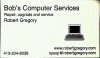
Specifics:
Mixed fonts
No commercial logo
Aspect ratio of the laptop is very skewed
Poor quality image (blurred)
I don't understand the relevance of a 'blue flame' to computer repairs services
TBH I would not use something that looked like this and I would not advise another business owner to.
")